But yeah, from experience my kits have gotten smaller and smaller as time keeps passing. Less things, less colors, smaller bags. I find how much time it takes for you to be ready to draw and to pack up once you are done are key. I've carried plenty of things "just in case" that ended being more obstacles than actual help. Weight is also a great factor, and when it comes to watercolor and water media a bit of an issue: water is the one thing you cannot make smaller no matter how much you try.
As for my kits:
The "Time to go out and see if I paint anything" kit:
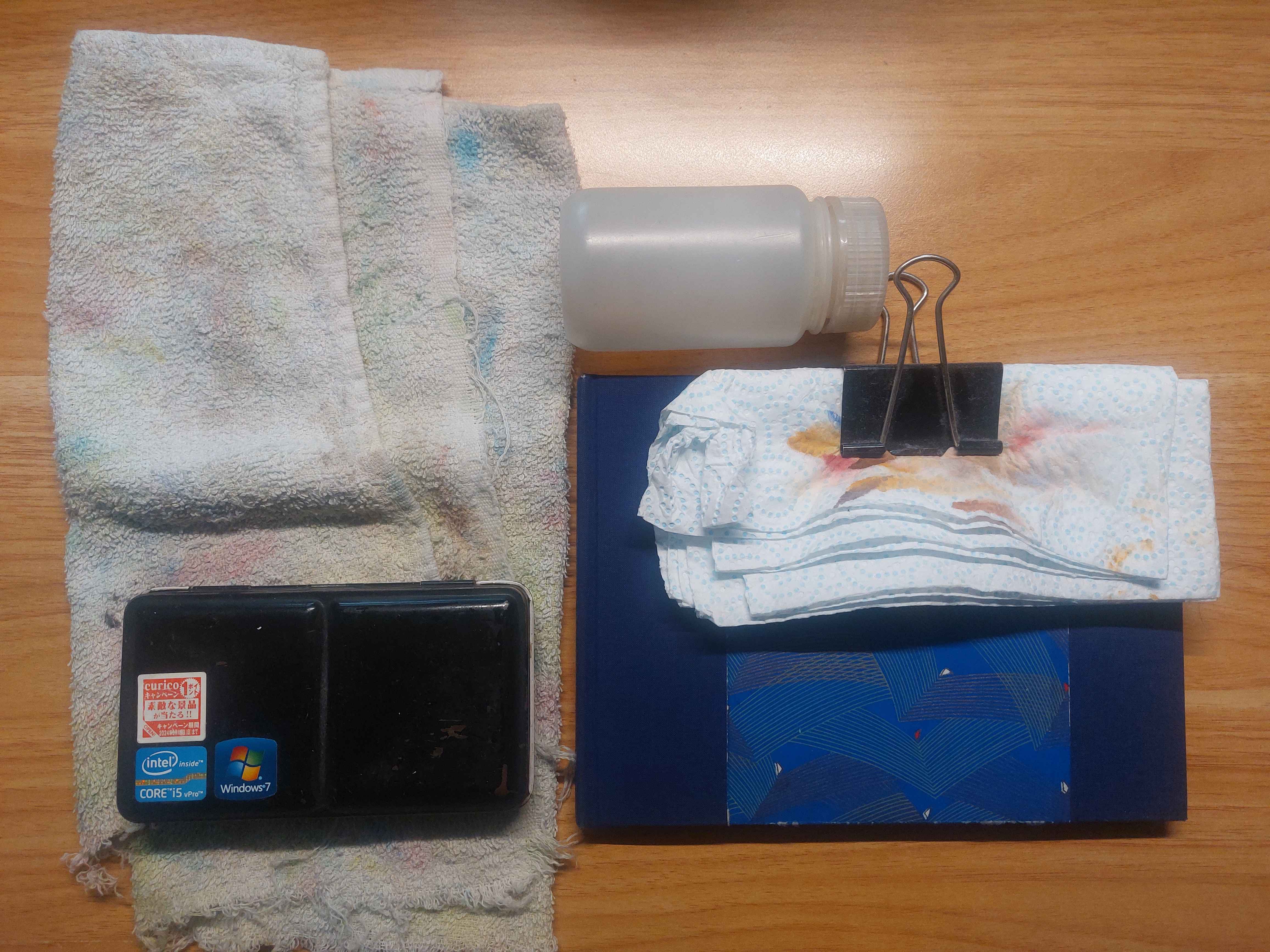
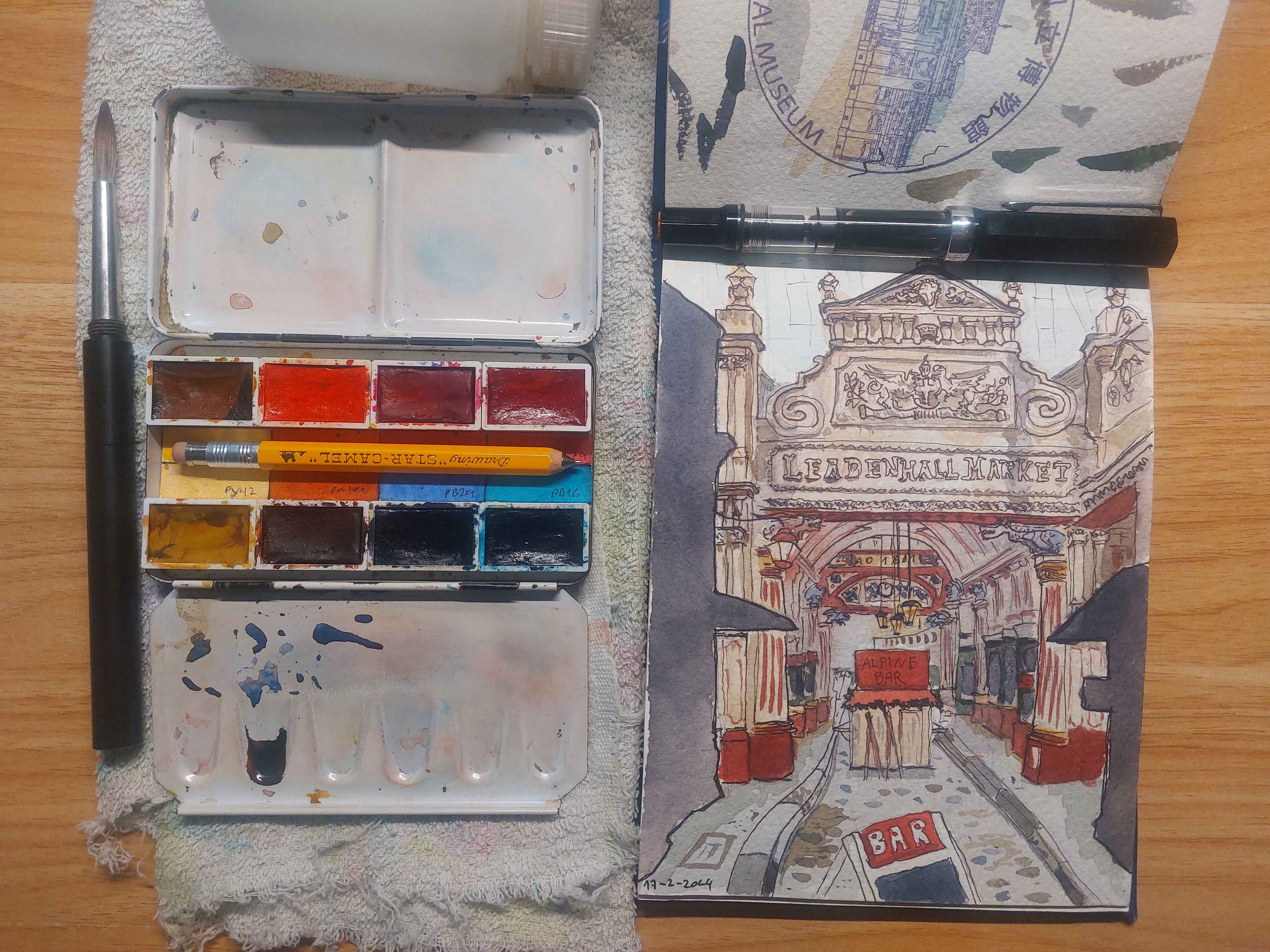
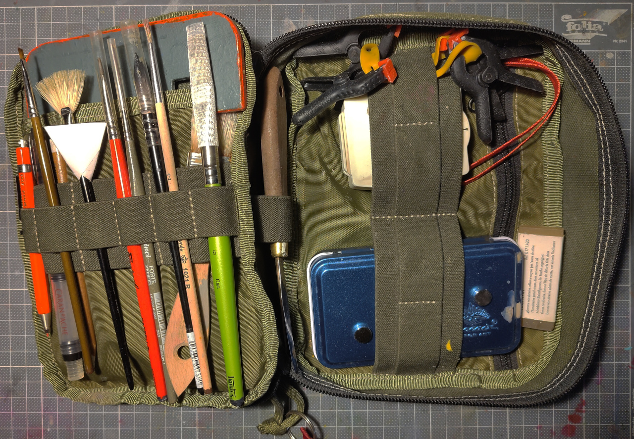
I've tried multiple palletes over the years and still rotate over them, but I always come back to this small tin one. Having the space to hold a small mechanical pencil and a brush inside saves me a bit of space. Nowadays I reduced my palette to eight colors. I will talk about that after because what colors I used has been a thing I've spent way too much time thinking about over the years.
The sketchbook is a slightly under A5 watercolor sketchbook made by myself. Fabriano Artistico 100% cotton paper. I tend to be more sloppy when it comes to bookbind things for myself, as these things are going to be beaten up a lot by carrying them around, so i don't want something that delicate that I feel like I have to babysit.
The fountain pen contains waterproof pigment in. I mostly use Rohrer and Klingner SketchINK inks as are the ones I found to be more reliable and more unlikely to clog a pen if left for too long. I mostly have black, sepia and grey, but I want to get dark bluy and dark red for a less stark linework and to play with warm and cool lines.
Only one brush. I like flat brushes but I feel any full brush I bring ends being more of a hassle than anything. The brush is a Da Vinci Casaneo travel brush size 8, but I've used multiple collapsible brushes over the years. This one is just good and also I managed to get a few very heavily discounted. They are synthetic, closer to squirren than sable and therefore not having a tip for detail. But I find that synthetics that are made for detail end wearing out their tips way too fast. And besides, I am sketching outside, I should think more of Big Brushwork and less finnagling with thin lines.
For water aI use a Nalgene wide mouth 125ml jar. I used to carry two, one for mixing and another for clean water, but having two banging around ended being too much of a hassle and also it's double the weight. You may think that 250ml of water is not too much, and you are right. But when carrying kits like these around, a ounce is a pound and you end feeling every single extra gram of weight you did not need to carry. Anyway, this one's are really neat, watertight and resistant. I have throw them to the floor to test them and they hold up. So I can carry that dirty water with me until I find where to get it disposed.
And you know, a torn towel and kitchen paper for cleaning the brush after rinsing.
"I carry this in my pockets if my jacket allow me to" kit
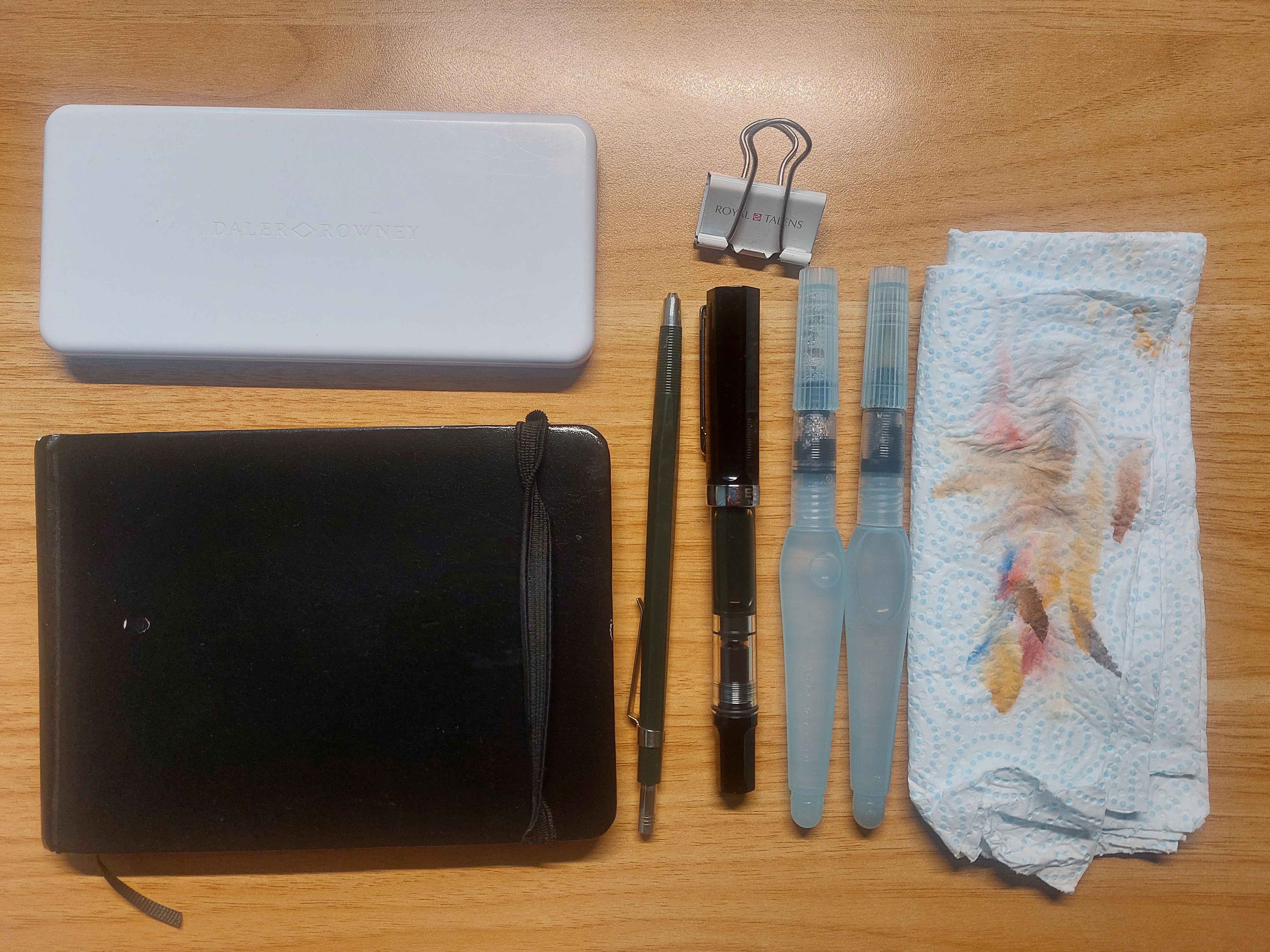
Almost the same kit, just everything way smaller.
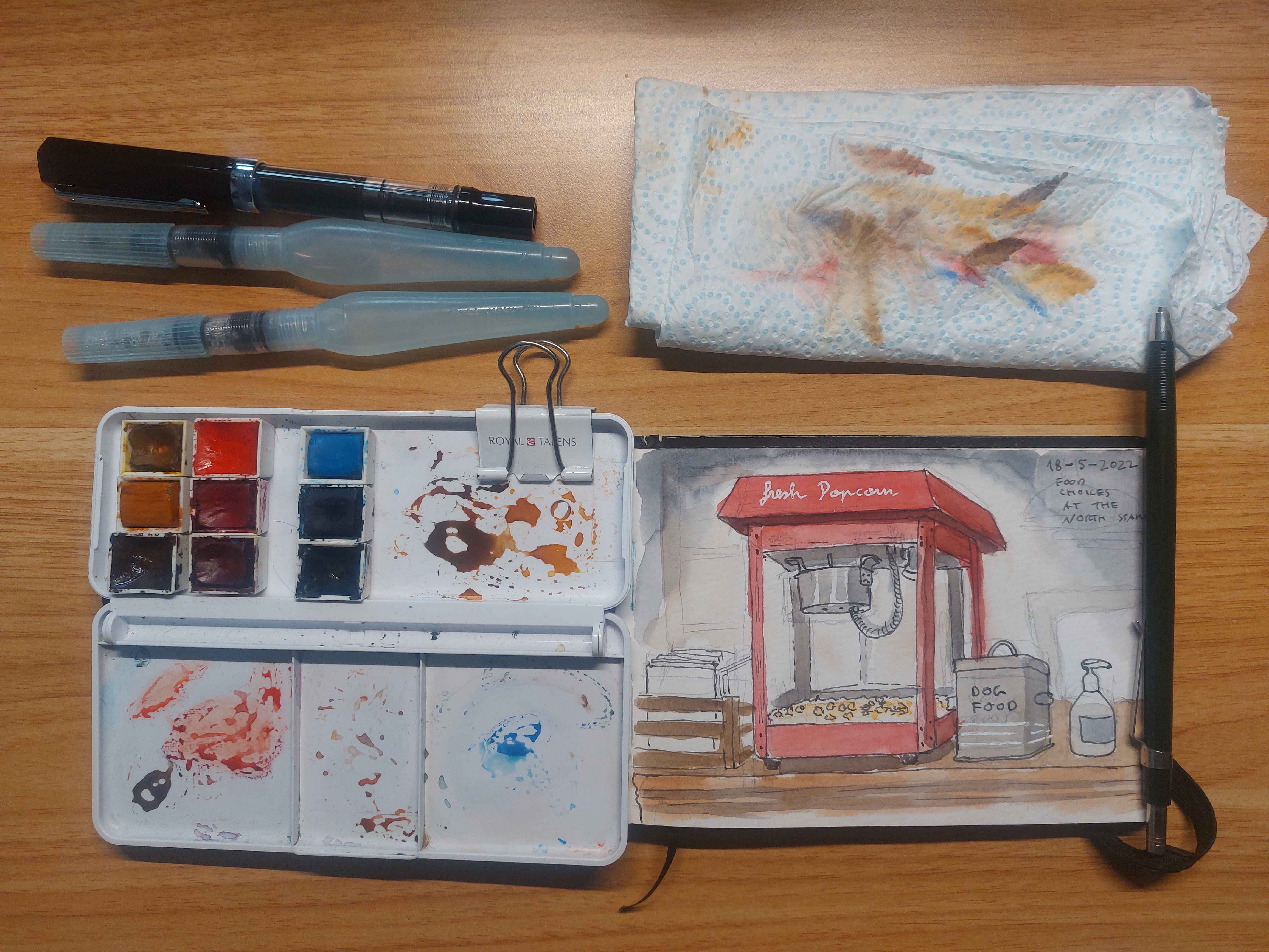
The palette is a Daler Rowney student watercolor plastic palette with the interior ripped off and the half pans held on with blue tack. I used to use the same small watercolor palette than Minasheep but this one has way wider mixing areas and also is basically the shape of a thin smartphone, so it's really easy to pocket. Same colors as the biggest one plus one extra because having a row with only two pans bothered me. Can be held with clips int he page I am not using, I've also used it with the bigger sketchbook.
An A6 watercolor sketch, this one actually bought. It's a Seawhite of Brighton sketchbook, paper is not cotton but they are really good for how cheap they are. Sometimes I use watercolor postcards instead. I love painting postcards and sending them to people, it makes me happy.
Same fountain pen, whatever mechanical pencil I may have around that's not going to stab me by carrying it and two waterbrushes. I am becoming more of a convert of the waterbrush as time goes on. They don't apply washes as good as a proper brush, but their conveninence can't be beat. I am starting also to carry them instead of the entire brush and jar with the bigger sketchbook and I am happy with it. Yeah, I may miss in some watercolor kits, but when painting outside the less inconveniences you create for yourself the better.
Kitchen paper, easy to fold, easy to throw to a recycling bin once I am done, convenient.
The Colors
I should have not spend that much of my lifetime reading about colormaking, pigment properties and other stuff just to reach to this.
Picking colors to paint outside it's interesting becuase your decision is affected by more than "how the color look like", for a plein air palette I tried mutliple things, but for watercolor what has worked for me is:
- Compact, but not too compact: too many colors add to decision paralisis and paintings that look too busy, but also too little ends with you spending more time mixing than you may want. This one used to be twelve, managed to get to eight. I could get it down to six but the couple I could get out are colors I like.
- Lightfast: for something that's going to be on a sketchbook is not that important, but I am very nitpicky in having evevery single thing I make to be as archival as possible
- Transparent: Semi opaque and opaque colors are very useful, but they are trickier to use and very easy to mess up in a plein air context, so I keep them out. They are also harder to rinse from the brush, which you think is not a factor but when you are outside it really is.
- Non toxic: or at least without any heavy metals in them. This one is way harder to accomplish as it leaves stuff like Pthalo Blue out, but I want my dirty water to be as safe as pour anywhere as possible.
- Non staining: not exactly for doing lifting (I don't do much) but because staining paints tend to get the water dirty faster and also are harder to wash from the brush.
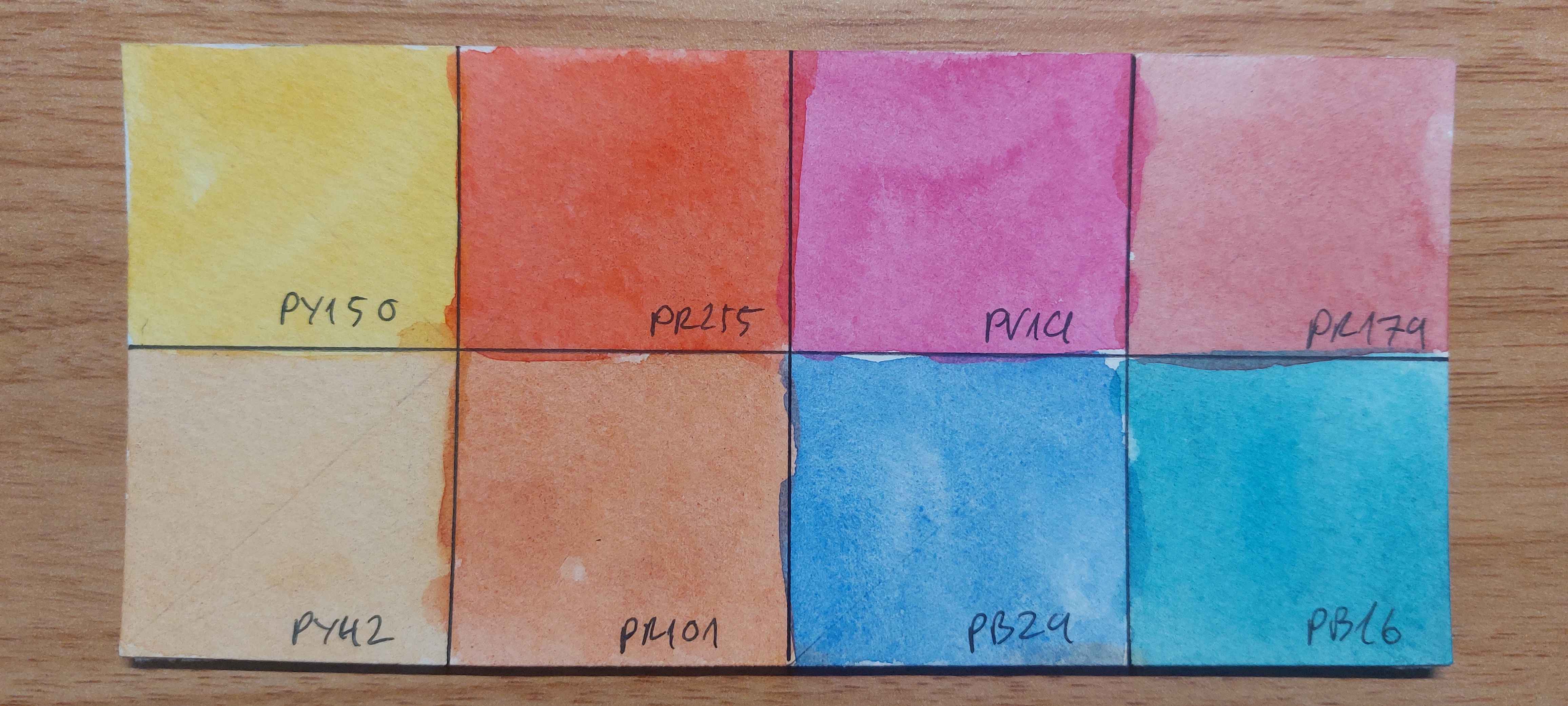
Ok, ok, sorry. With these things in mind, and including pigment designation.
- Nickel Azo Yello (PY150): The one of two transparent yellows avaialble (the other being Py128). Yellow is the backbone of your palette and getting one with these restrictions is very, very hard. And this one has nickel, so it already fails not containing a heavy metal and it's a bit staining. But it is less staining than the more overpowering PY128 and it is the moxt flexible yellow you can get. Warmer in masstone, colder diluted. Powerful enough it doesn't get lost in mixes and probably the best single yellow you can carry around.
- Pyrrole Scarlet (PR255): Way warmer than the standard pyrrole red and more orange than what you would want to for a "ideal red" but it is transparent, mixes oranges very well and you can turn it into a fire engine red without much issue. It has become a staple.
- Permanent Rose (PV19): Instead of a magenta. Very useful color for basically everything, specially skin colors. Not much to say about outside not all brands offer a lightfast PV19, so be a bit careful about it.
- Perylene Maroon (PR179): Deep muted red. Not exactly esssential, but I like it a lot, I am a deep reds and maroons type of person. Also useful for shadows and skin colors.
- Italian Earth or Raw Sienna, can't remember (PY42): Honestly, whatever transparent yellow earth tone I may be trying at the moment. I rotate this one a lot becuase I am still finding for my idea yellow earth tone. This and the red earth tone are two of the paints I use the most, so I go through a lot of these.
- Transparent Red Iron Oxide (PR101): It's a bit wild on washes and tend to jump into other wet colors a lot, but I prefer it over standard Burnt Siennas for it's transparency and that I like the rusty look over a standard brown. I like my burnt sienna style color to be closer to a dull orange than a more chocolate brown.
- French Ultramarine Blue (PB29): One of the few where I am a bit specific, Winsor and Newton one strikes the right hue for me and also has proven to be reliable, so I am sticking with that one. It's ultriamarine blue, what do you want me to say, it's THE blue. The other most used color, as it is a complementary with Transparent Red Oxide and the mix of the two is what I use as a shadow color and a black.
- Pthalo Turquoise (PB16): The one oddity in my palette, copperless pthalo. It is way greener than other shadows of Pthalo (PB15) which makes it a bit less useful by itself but good for mixing colors. You get more intense greens and also it neuters ultramarine better for getting a fake ceruelan by adding a bit to it (cerulean is both non transparent and also contains cobalt, so as much as I love it I had to take it out).